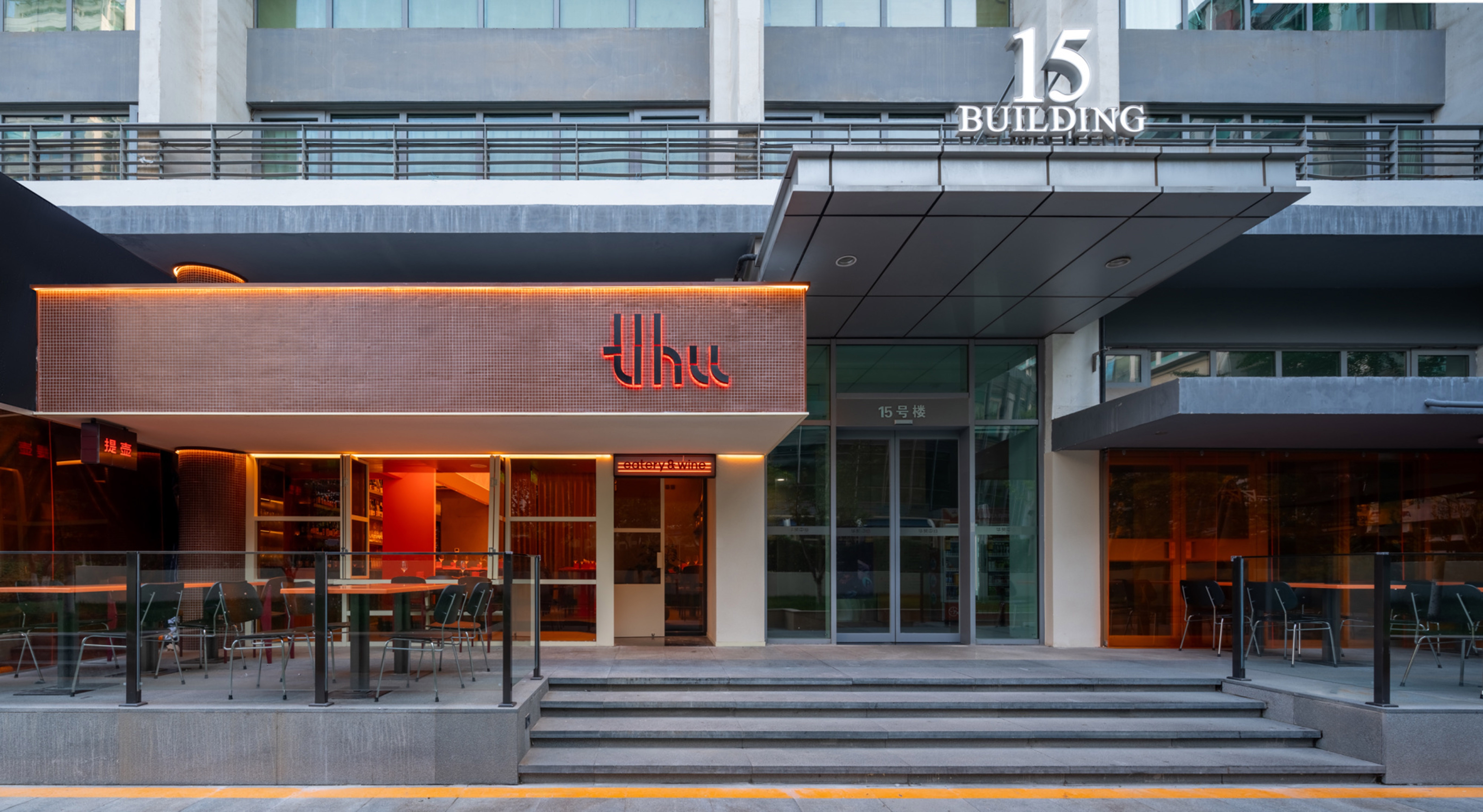
A convenience store at night, where everyone can get energized, recharged, and ready to start over. Tihu is thus a "convenience store tavern", where the customers fill the energy of the space and then it is given back to them; the space, and the people, through the transformation of moods, will spread all kinds of emotions in the cold night city, and bring a wonderful sense of healing and attraction to the people who stop by here.
The overall color tone of the space is set as an associative color from orange to yellow, and the color scheme and materials are matched with this color value range. Without excessive decorative treatment, we respect and keep the wall structure of the original architectural construction, dappled or rugged, all by color to do with.
At the same time in this space, we still adhere to the people-oriented purpose, the dazzling orange is mostly used for desktop props, and the guests are the main scenery we want to present in this space.

